Let me begin this post with mentioning that I've finally made up my mind between Barack and Hillary.
In a recent New York Times article titled "In Painful Past, Hushed Worry About Obama" the nation is worried about Obama's safety. The article cites the assasinations of MLK Jr. and RFK to justify citizens' fears.
One thing that struck me out of the ordinary was this:
"Before Mr. Obama decided to run for president, he discussed his safety with his family. His campaign employed a team of private security guards before he was placed under Secret Service protection. Since then, he has grown fond of the agents who surround him, inviting them to watch the Super Bowl at his home in Chicago and playing basketball with them on the days he awaits the results of an election."
He plays basketball with his Secret Service?!
Anyway, the article didn't elaborate on who gets more protection. Bummer.
"The Secret Service does not discuss details of its protection, including whether Mr. Obama is receiving more protection than Mrs. Clinton.
But my point with this little detail is that it is so telling. It humanizes him and paints a picture that feels like home.
For some reason, when I think of Hillary's meaningful detail, all I can think of is that stupid scene of her crying after being asked a question along the lines of "How do you do it?"
Puh-leaaaaze.
Friday, February 29, 2008
"The gay vote"

At the end of the rainbow is a pot of gold! ...Well for Clinton and Obama that is! Both are fighting for the "gay vote." But as Clinton has been a favorite to the gay community (for example her walking in the gay parade in 2000) alot of the gay community is crossing over to Obama. Both Clinton and Obama oppose same-sex marriages while supporting civil unions.A major difference between the candidates is that Obama supports full repeal of the 1996 Defense of Marriage Act, a law signed by Bill Clinton -- under pressure from a Republican-dominated Congress -- that prohibits federal recognition of same-sex marriages and permits states to do the same. Hillary Clinton wants to roll back only part of the law.Hillary is also tied to the "Don't ask don't tell" which reversed a campaign pledge he made to allow gays to serve openly.So it all boils down to the Texas and Ohio primaries...Obama has full-page advertisements in gay publications in Texas and Ohio.Clinton's campaign started a statewide committee this week to undertake efforts in gay areas of Cleveland, Cincinnati and Columbus. Even though Clinton has a long relationship with the gay community, it may not be enoough to out weigh Obama's success and popularity. Clinton better cross her fingers...
Bring On The Ads
This week the attack ads are out in full view. With four days to go until the Texas Primaries, the democratic candidates are taking swipes at their apponents with new ads designed to make Americans uneasy. First Hillary released an ad showing a house at night with sleeping children and asked "who do you want answering the phone in the middle of the night?" Her add:
Obama retaliated by saying this ad is much like others that have come before it in trying to put fear into the american people.
However, several hours later, Obama ran an extremely similar ad.
Obama's pitch during a rally today claimed that Hillary's ad is legitimate, but the focus shouldn't be on who picks up the phone, but rather what that person will do to address the situation. A valid point.
It seems Hillary is now ready to gamble with ads such as this one to try and attact voters in the last push before the next primaries. If she was ahead of Obama by a landslide, she probably would not be resorting to these types of tactics.
If she looses, I blame her management. They underestimated Obama from the start and she should have tried to attract more voting groups such as youths and women. Many people in the beginning felt she was a shoe-in and I think Camp Hillary did not aggressively go after voters in the beginning.
Her campaign started out slow while Obama's started out running and hasn't looked back.
Is the Clinton Campaign Getting Desperate?
Since Feb 9th, Sen. Barack Obama has swept everyday of primaries in the Democratic race, winning 10 consecutive states. Sen. Hillary Clinton now finds herself trailing Obama 24 to 13 in state primaries won. According to the projected Democrat Delegate Account from the New York Times, Obama is projected to earn approximately 92 more delegates than Clinton. With the odds starting to amount against her Hillary Clinton is looking to do whatever she can do to regain the lead in the Democratic race; including commercials:
It appears that Clinton is getting desperate and is taking to the offensive to get her name back. I think that this commercial is absolutely ridiculous. The commercial says that, "you want someone, who has already been tested to lead in a dangerous world." The one question that I have is, I thought this was a Hillary Clinton commercial, not a Bill Clinton commercial. Bill Clinton was the 42nd President of the United States and could therefore be the only Clinton that has been "tested to lead in a dangerous world," not Hillary.
The Obama campaign made a response to the Clinton commercial (shown below), pointing out that Obama did not support the war, while Hillary Clinton did. I really liked this response by the Obama campaign because Hillary Clinton is going to regret making the commercial with a message that could be easily countered. I think that this is now Obama's race to win or lose after not only embarrassing her in recent polls, but using her own commercial against her.
Obama Campaign's Commercial Response:
Friday, February 22, 2008
website critique-
Ask.com- Much like its competitor, Google.com, Ask.com is very plain. It provides just the bare basics for its users on its homepage. It has a very clean look and the layout is easy to navigate, even for those who hardly ever frequent the web. Once you start typing, the real fine qualities of Ask.com become apparent. When you start typing a search entry, the website will give you closely related searches based on the spelling of the word you type. Let’s say I type in “bl-“, the search engine will give me a list of searches underneath the toolbar. This brings up searches like: blonde jokes, blue book, and blog. It is a convenient way of searching for something you don’t quite know how to spell.
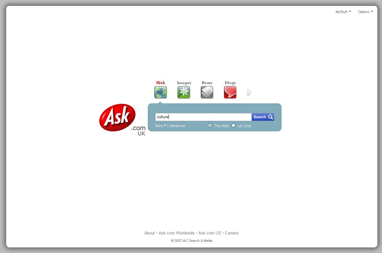 Once typing in a search, Ask.com pulls up a wide range of useful information. Broken up into three columns, Ask.com lets you really dig into the vast amount of information the internet provides. On the right-most column Ask.com lets you scroll through some related video, pictures and even music- if you searched for your favorite band. On the left-most column is a guide to help you narrow or broaden your search.
One of the coolest features provided by Ask.com is the binocular feature. This feature allows you to take a quick peek at the websites listed. All you have to do is scroll over the little binocular picture located next to the web-link and a screen shot of the homepage of that website shows up. In case you remember what the website looks like, but don’t exactly remember the name, this feature is a great help.
Wikipedia.org- Totally forbidden by academic teachers, Wikipedia offers a very accessible encyclopedia for those looking to grab a quick idea of what something is all about. This website contains user generated material. This user-based material worries many teachers and professors across America because much of the information is not verified; therefore making it at times, unreliable.
In the time of this new digital revolution, something like Wikipedia fits right into the mindset we have started to develop as creatures of the web. We enjoy sharing information with those around us and listening to others opinions and ideas. What was the most viewed video from the tragic events at Virginia Tech? It was a video taken by a student on their cell phone.
People are capable of being the watchdog over the information they consume, like that provided on Wikipedia. If someone notices an error on a page they just notify the people who run Wikipedia and ask for a correction or do it themselves if they have an account. It is a self governed- user provided website that is easy to use.
At the bottom of ever entry there is a list of related links and sites to further your understanding of whatever it was that you searched. Wikipedia comes in many languages, making it an international site that connects the knowledge of everyone interested in contributing.
TMZ.com- This online gossip magazine has more traffic than it knows what to do with. There are many reasons why this is true. Number one is the content they provide. It seems people these days love to read about the stars and all the gossip that comes with them. With the look of a blog, this celebrity news site is easily navigated. The stories are short and sweet and always contain some photo or video. They provide the information in the way that the reader wants to consume it. No one wants to sit at their computer for a half-hour reading about Britney Spears getting arrested. They want a quick blurb of what happened and a video or picture of her in her jail-cell best.
Another great innovation that TMZ provides is something people in the business call, “convergence”. They provide multiple media outlets covering the same story. An example of this is the various links TMZ provides linking you to videos found on the web and outtakes from their television show. The site provides a little entertainment, as well, giving the browser a variety of games to play- giving the site multiple hits and keeping those viewing the site, on the site. TMZ also has links to other blogs, which furthers the continuous traffic going in and out.
All three of these sites have a common theme and that is a clean, easily navigated homepage. These sites look to provide the most information in the fastest, most easily manageable form. They do not look to confuse the browser. All three websites are very user friendly- even those who are not that computer-literate will have an easy time searching these pages.
Another similarity between all three websites is that they look to provide a wide variety of media forms- video, pictures, sound clips, etc. The real aim of these websites, and any well designed website, is to keep you on their site and provide everything for you. They do their best to create their own little Wal-Mart. They don’t want you to have to go anywhere else for information.
I think all three websites are great examples of successful sites. It is clear that there is a format that works online. There is a standard that most websites look to closely follow if not duplicate. Everyone knows the saying- "Less is more"- and all three sites try to abide by this golden rule- especially Ask.com. The only other website with the same amount of @#!$ as Ask.com is Google.com and Google may do it better. Going on name recognition alone, both websites are able to really get down to the bare minimum and streamline their site for the cleanest and easiest look.
Once typing in a search, Ask.com pulls up a wide range of useful information. Broken up into three columns, Ask.com lets you really dig into the vast amount of information the internet provides. On the right-most column Ask.com lets you scroll through some related video, pictures and even music- if you searched for your favorite band. On the left-most column is a guide to help you narrow or broaden your search.One of the coolest features provided by Ask.com is the binocular feature. This feature allows you to take a quick peek at the websites listed. All you have to do is scroll over the little binocular picture located next to the web-link and a screen shot of the homepage of that website shows up. In case you remember what the website looks like, but don’t exactly remember the name, this feature is a great help.
Wikipedia.org- Totally forbidden by academic teachers, Wikipedia offers a very accessible encyclopedia for those looking to grab a quick idea of what something is all about. This website contains user generated material. This user-based material worries many teachers and professors across America because much of the information is not verified; therefore making it at times, unreliable.
In the time of this new digital revolution, something like Wikipedia fits right into the mindset we have started to develop as creatures of the web. We enjoy sharing information with those around us and listening to others opinions and ideas. What was the most viewed video from the tragic events at Virginia Tech? It was a video taken by a student on their cell phone.
People are capable of being the watchdog over the information they consume, like that provided on Wikipedia.
If someone notices an error on a page they just notify the people who run Wikipedia and ask for a correction or do it themselves if they have an account. It is a self governed- user provided website that is easy to use.At the bottom of ever entry there is a list of related links and sites to further your understanding of whatever it was that you searched. Wikipedia comes in many languages, making it an international site that connects the knowledge of everyone interested in contributing.
TMZ.com- This online gossip magazine has more traffic than it knows what to do with. There are many reasons why this is true. Number one is the content they provide. It seems people these days love to read about the stars and all the gossip that comes with them. With the look of a blog, this celebrity news site is easily navigated.
The stories are short and sweet and always contain some photo or video. They provide the information in the way that the reader wants to consume it. No one wants to sit at their computer for a half-hour reading about Britney Spears getting arrested. They want a quick blurb of what happened and a video or picture of her in her jail-cell best.Another great innovation that TMZ provides is something people in the business call, “convergence”. They provide multiple media outlets covering the same story. An example of this is the various links TMZ provides linking you to videos found on the web and outtakes from their television show. The site provides a little entertainment, as well, giving the browser a variety of games to play- giving the site multiple hits and keeping those viewing the site, on the site. TMZ also has links to other blogs, which furthers the continuous traffic going in and out.
All three of these sites have a common theme and that is a clean, easily navigated homepage. These sites look to provide the most information in the fastest, most easily manageable form. They do not look to confuse the browser. All three websites are very user friendly- even those who are not that computer-literate will have an easy time searching these pages.
Another similarity between all three websites is that they look to provide a wide variety of media forms- video, pictures, sound clips, etc. The real aim of these websites, and any well designed website, is to keep you on their site and provide everything for you. They do their best to create their own little Wal-Mart. They don’t want you to have to go anywhere else for information.
I think all three websites are great examples of successful sites. It is clear that there is a format that works online. There is a standard that most websites look to closely follow if not duplicate. Everyone knows the saying- "Less is more"- and all three sites try to abide by this golden rule- especially Ask.com. The only other website with the same amount of @#!$ as Ask.com is Google.com and Google may do it better. Going on name recognition alone, both websites are able to really get down to the bare minimum and streamline their site for the cleanest and easiest look.
Thursday, February 21, 2008
Website critique
- 1
Upon my first arrival to the website it is very noticeable that the homepage is very evenly distributed and sectioned giving the viewer the ease of navigation. Its layout mainly consists of three columns. The center column divides the newest stories by its content topic. Those topics are also accessible at the top of the page just underneath the banner. The very first thing I notices about the layout is a link for subscription on the banner at the head of the page. This is important as magazine websites must implement technical strategies to keep circulation of their print editions fairly substantial. A standout visual element is the use of a slideshow to display the biggest stories for Inside the US News & World Report. Usnews.com also offers some of the key Web 2.0 features such as RSS feeds, podcasts, mobile versions, reporter blogs, email and subscriptions. The site offers plenty of video and also the ability to subscribe to a US News video RSS feed. The ability subscribe to feeds such as podcasts and RSS, along with the ability to sign up for email alerts make the site very delivery customizable.
One of most important criteria for evaluating the Website is the available means of consumer participation and customization. Usnews.com seemingly has a void that is left missing the feature of user commenting. Users cannot comment on articles or even blogs. However, the site does attempt to fill that void with the use of user friendly blogs such as “The Paper Trail”, which is a blog dedicated to stories surrounding college campuses. The Paper Trail blog links to stories from campus publications written by student journalists. Overall, Usnews.com does not seem to have many commonalities with its print version. “Breaking News” and “The News Desk” sections make the site appear to be its own species. Consumers are able to subscribe to the print edition and even subscribe to the web-based digital edition for the same price. The implementing of a digital edition shows that usnews.com serves mainly as a relative alternative to the print edition.
- 2
CNN is one of my favorite sites to visit because of the amount of content available on the site. The home page is very clean and has minimal amount of advertisements on it. It is sectioned off into three columns, which is very typical. There is a poll on the home page which serves as a good way to get extra hits. CNN does a very good job at making this site as similar to its broadcast network as possible. They do this through the endless amount of video content on the site. There are options that allow you to watch live videos and there is a whole section of the site devoted solely to video. The site is customizable because it allows you to select the regular CNN site or the CNN international edition as your homepage. There is also a section on the site called CNN tv that gives plenty of attention to its broadcast programs. It lists the schedule and lineup for it television programming and serves as a perfect supplement for broadcast and it directs viewers to stay at home with CNN. The site offers delivery through the use of podcasts, RSS and email alerts.
- 3

Deadspin.com is a blog devoted to sports. It has a very unattractive physical appearance because it is very bland. It pretty much has a one column set up that most blogs are known for . Nothing about this site really makes me want to stay on it. There are no cool photogaraphs or anything appealing on the homepage. All it really has to offer is what blogs are known for, its content. This site is highly user interactable. Users are able to comment on all articles and voice there opinions. There is not much more to say about the site because there is not much more on it!!
Critique
MSNBC.Com www.msnbc.com
LOS Angeles Timeswww.latimes.com
Gossip Blog:www.couturecandy.comwww.couturecandy.com
MSNBC is an online news organization.
On the MSNBC website there is one featured story that has a red border and labeled “breaking news in world news.” It is the primary focus on the homepage but it you scroll down a little the Honda Accord advertisement is a much bigger picture then the featured story. The left hand side has categories about world news, politics, health, science, business, entertainment, travel, sports, technology and other tabs. However if you scroll down, the categories are showing horizontally with articles underneath. Each category has its own multimedia section for videos. Ironically CBS has the same format. CBS also has a featured story but it’s advertisement on the right side (in the same place as MSNBC’s advertisement) is also bigger than the featured story picture. The columns are horizontal and marked by categories. Each column has articles to link to and multimedia with RSS feeds. They both had a section for crossword puzzles and comics on the left hand side. The CBS news website had fewer advertisements than the MSNBC site, with less clutter and more stories. The MSNBC had a bigger masthead then CBS and embraced their rainbow colors that brand their name. CBS also did not put up times for when they revised or updated a story. So I never knew what time an article was published, unless I did an estimate from the times when users left comments. The cool thing about both news sites is their wide use of multimedia. Both sites use RSS feeds, podcasts, email and mobile updates.

Finally…The Gossip Blog CoutureCandy.com
It’s So similar to its rival PerezHilton.com! When I logged on the page, that was my immediate thought. There is a big difference between them though; the couturecandy website has a sidebar next to every picture of a celebrity, which has an advertisement for clothes that look like what the celebrity is wearing. This is perfect for the fan obsessed with looking like their favorite celebrity, and it’s a great way to advertise. The couturecandy website also copied Perezhilton with the type written over the photographs. However the couturecandy page had nicer things to say about the celebrities then Perezhilton. Both websites are a fan of pink….hmmm, don’t know why? But it has become the color to brand perezhilton into the top gossip blog. Perezhilton is a fan of using advertising for the website back drop and not afraid of throwing them all over the website. I actually liked the style of the Perezhilton page, and I like the big masthead that has the Perezhilton font look similar to the Hollywood sign in California. Wow and some of the ads on Perezhilton are quite provocative. There is an adult sex dvd advertisement and a sex toy ad. Both sites allow comments, but (obviously) Perezhilton has comments for photographs that range in the hundreds. The site has become very popular and therefore more users are on it interacting.
In observing all three news/blog websites and their competitors, I noticed how similar all these sites look. The column set up, the colors, the placement of advertisements and use of similar fonts. It makes me wonder…why do we sometimes always go to one website over another?
LOS Angeles Timeswww.latimes.com
Gossip Blog:www.couturecandy.comwww.couturecandy.com
MSNBC is an online news organization.
On the MSNBC website there is one featured story that has a red border and labeled “breaking news in world news.” It is the primary focus on the homepage but it you scroll down a little the Honda Accord advertisement is a much bigger picture then the featured story. The left hand side has categories about world news, politics, health, science, business, entertainment, travel, sports, technology and other tabs. However if you scroll down, the categories are showing horizontally with articles underneath. Each category has its own multimedia section for videos. Ironically CBS has the same format. CBS also has a featured story but it’s advertisement on the right side (in the same place as MSNBC’s advertisement) is also bigger than the featured story picture. The columns are horizontal and marked by categories. Each column has articles to link to and multimedia with RSS feeds. They both had a section for crossword puzzles and comics on the left hand side. The CBS news website had fewer advertisements than the MSNBC site, with less clutter and more stories. The MSNBC had a bigger masthead then CBS and embraced their rainbow colors that brand their name. CBS also did not put up times for when they revised or updated a story. So I never knew what time an article was published, unless I did an estimate from the times when users left comments. The cool thing about both news sites is their wide use of multimedia. Both sites use RSS feeds, podcasts, email and mobile updates.

The Los Angeles Times online newspaper website has its typical paper font (almost identical to the NY Times font) used on the website for the masthead. The categories were on the right hand side organizing the news into science, sports, business, entertainment and so on. I like the fact that the NY Times categories even have sub- categories. For example, Underneath the Arts category is links to books, movies, music, television and theatre. They really break it down and make searching for things very accessible. If you scroll down the page it’s also available in a larger font, incase if your eyes glaze over the categories. The large, centered photograph distinguishes the article as the featured story. There is another advertisement in the same section as the MSNBC and CBS websites. However the LA Times advertisement is not bigger than the featured story photograph. I feel the LA Times website is cluttered and my eyes tend to wander. The LA Times site has a section on the right side for the most viewed and most emailed, but the NY Times sight has almost the same sidebar labeled “most popular.” It contains the articles that were most emailed, blogged and searched for. It’s hard to compare any newspaper to the NY Times, because they’re the most credible and reputable new organization. There is just no comparing! The NY Times advertisements are even considerably small and disassociated with the website off to the lower left hand side. The NY Times has made such a name for themselves that the advertisements don’t own them and over crowd the website. My favorite thing about the NY Times is it’s expansive archive and the tabs on top of the masthead. If I missed the day before, I can click on today’s paper and scroll down to the calendar and click on any day to find out all the headlines. It’s so accessible! The LA Times search engine is nothing in comparison. Oh, another cool thing- The Times reader, which is a digital newspaper that reads like the real thing!

Finally…The Gossip Blog CoutureCandy.com
It’s So similar to its rival PerezHilton.com! When I logged on the page, that was my immediate thought. There is a big difference between them though; the couturecandy website has a sidebar next to every picture of a celebrity, which has an advertisement for clothes that look like what the celebrity is wearing. This is perfect for the fan obsessed with looking like their favorite celebrity, and it’s a great way to advertise. The couturecandy website also copied Perezhilton with the type written over the photographs. However the couturecandy page had nicer things to say about the celebrities then Perezhilton. Both websites are a fan of pink….hmmm, don’t know why? But it has become the color to brand perezhilton into the top gossip blog. Perezhilton is a fan of using advertising for the website back drop and not afraid of throwing them all over the website. I actually liked the style of the Perezhilton page, and I like the big masthead that has the Perezhilton font look similar to the Hollywood sign in California. Wow and some of the ads on Perezhilton are quite provocative. There is an adult sex dvd advertisement and a sex toy ad. Both sites allow comments, but (obviously) Perezhilton has comments for photographs that range in the hundreds. The site has become very popular and therefore more users are on it interacting.

In observing all three news/blog websites and their competitors, I noticed how similar all these sites look. The column set up, the colors, the placement of advertisements and use of similar fonts. It makes me wonder…why do we sometimes always go to one website over another?
Website Critique
The internet has countless numbers of websites that anyone can access pretty effortlessly. Some websites are more organized, credible, and easier to navigate than others. The choices are endless when it comes to finding a site to provide information one is interested in. Search engines like Yahoo and Google, enable one to find a website based on the information they want. These search engines give the internet user a huge variety of sites to choose where they want to get their information from.
One website I go to frequently is CBS. When you first go to the site, you are bombarded with moving images and colorful ads on the side and top. Although these images are a distraction, they are essential because it is a television website and it wouldn’t attract as many people, minus the images of the television shows. As for the ads, they also are a distraction when you go to the site. However, CBS needs these ads to function for the most part and make money to stay up and running.
The website is very interactive, with videos that users can watch of their favorite shows and forums to join and communicate with others. There is also a “Mobile” section, which one can purchase ringtones and games from TV shows that are sent to their cell phone.
Another function the site offers is “web exclusive” videos, which I think is strength. The main reason I think this website does so well is because it is very interactive and the television shows that are aired by this network are constantly accessible to the public. You can also access news and sports videos that are broadcasted on TV.
In my opinion, the biggest strength this site has is that it offers free viewing of full episodes of all of the most popular shows aired on CBS. I take advantage of this feature and I’m sure it is something that is responsible of the amount of traffic. All in all, CBS.com is easy to navigate and organized to find what you are specifically looking for.
The second website I chose was mediabistro. This is a website that is intended for writers and people in the journalism field. It offers job opportunities, blogs, news feeds, and the top media news of the day. When you first go to the site, you see a huge advertisement at the top of the page. There are also distracting ads on the right side that blink.
This site’s overall web design in my opinion works very well and is organized so one can find what they are looking for with ease. As for the interactive features, there is Mediabistro on Demand, which allows users to watch speeches, tutorials, and panel discussions between writers. I think this is one of the website’s biggest strengths and is an attractive aspect of the site. However, there is a downside to this function. You can only preview the videos and you have to pay to watch the entire video. Even though it’s unfortunate for users, without this mediabistro would most likely not be able to maintain the site.
The final website I chose was the Washingtonpost site. While analyzing it, I couldn’t help but to compare it to the New York Times website. The two are very similar, pertaining to web design, layout, and ad placement. At first glance, there are few images and a lot of bold text and headlines. I don’t think the site needs a lot of images, considering it is a newspaper organization. All of the top stories are the first thing you see and all of the different sections of the Washington Post are available at the top bar. You can click on any category and the stories that are relevant to the specific category come up.
As you scroll down, there are different blogs and photo galleries. At the top right side, there are the most viewed stories of the day. That is a feature that is strength to the website because people often read stories that are the most popular before anything else.
Some, not all, of the top stories of the day also have videos that correspond to the story. The videos are from other major news outlets, such as CNN and CBS news.
The internet serves as an infinite source of information. Some websites are more credible and organized than others. The most successful sites are easy to navigate, have interactive features such as images, video, and blogs, and have a good layout.
Top 3 Elements Need to be Crowned the Best Rapper Alive
Theres a lot of controversy in the hip-hop world these days over who is the "best rapper alive." While there are many artist who are on the grind and moving units, there are many factors that can determine who actually has what it takes to be deemed the B.R.A.
TOP 3 FACTORS
SWAG -Swag is basically someone’s whole demeanor, what makes them unique. It includes everything from a rapper’s fashion to their ad-libs and lingo on the microphone. The leader in this category right now has to be Lil’ Wayne Weezy F. Baby is well known for his reverberating voice, ad-libs, and his country slur making his swag on the mic top-notch. He has elevated from the status of your average rapper to become a diversified rock/pop/hip-hop icon.
MARKETABILITY-A rappers marketability is greater when they are able to capitalize on current pop-culture trends. Other factors, such as good looks and lyrical content also make an artist more marketable. Marketability determines the potential revenue that an artist will bring in. Past trend have shown that rappers who are able to step outside of the typical hardcore, gangster rap mentality and make songs that have commercial appeal have been more marketable. Soulja Boy is the leader in this category.  Soulja Boy has capsized on the "song and dance" craze that has been gaining momentum in hip-hop music. His youth also helps his music reach out to a broader range of hip-hop’s most prized consumers.
LYRICAL CONTENT/MESSAGE -Lyrical content/ message is what the rapper is actually saying in their songs. This includes wordplay and the actual context of the song. It is hard to choose one person for this category. Jadakiss, Jay-z, and Nas are the obvious favorites for this category. But right now I would have to say that my lead vote getter is none other than Mr. Cool himself, Lupe Fiasco.  Lupe’s strengths are in his lyrical message. His songs have the elements of a classic poetry slam. He is a new artist but his lyricism and diversity has made his rise to pop-culture stardom fairly quick. He has topped both the hip-hop and pop charts with his latest album The Cool.
Weezy F. Baby is well known for his reverberating voice, ad-libs, and his country slur making his swag on the mic top-notch. He has elevated from the status of your average rapper to become a diversified rock/pop/hip-hop icon.Soulja Boy has capsized on the "song and dance" craze that has been gaining momentum in hip-hop music. His youth also helps his music reach out to a broader range of hip-hop’s most prized consumers. Lupe’s strengths are in his lyrical message. His songs have the elements of a classic poetry slam. He is a new artist but his lyricism and diversity has made his rise to pop-culture stardom fairly quick. He has topped both the hip-hop and pop charts with his latest album The Cool.
Top Five
My Top Five Musical Artists
Here is a list of my favorite artists as of this month, from five to one:
Here is a list of my favorite artists as of this month, from five to one:
- Arcade Fire-
They are really just awesome. The two lead singers are married. They came out with an album not too long ago, Neon Bible. I went to their show in the Bronx—ZOMG.
- Spoon- An all-time favorite. First time I ever saw them was at Sirenfest with my first boyfriend back in high school. We broke up, but I still love the band! Spoon’s most recent album was Ga Ga Ga Ga Ga
- Feist- She’s making it big on the scene right now. For those who don’t know, she sang that “1, 2, 3, 4…” song in that I-pod commercial. I fell in love with a Bee Gees cover she performed recently of Inside and Out. But, the “1234” video is pretty good.
- Beirut My best friend is studying in Florence this semester. I went to her Myspace page not too long ago and listened to Beirut’s Nantes. Now whenever I hear it, I think of her and how much I miss her.
- Death Cab For Cutie- Favorite. Band. Ever. No questions asked, please. New album debuting sometime this spring. I = stoked!!


Three really good rock bands
Though it's hard to narrow down all the great rock bands of the world into a top three, I can name three bands that are really good.
The Rolling Stones Since the 1960's they have been cranking out the hits. The Stones were formed in London and to date have released 55 albums. They were ranked no.4 by Rolling Stone magazine as one of the 100 greatest artists of all time. The Doors The Doors were formed in Los Angeles in 1965. They were considered very original for their time because they didn't use a bass guitar while playing live. Instead, keyboardist Ray Manzarek would play the bass notes with his bass keyboard that had been newly invented. Manzarek was also known for his ability to pound an organ into submission. After taking the rock world by storm, the bands run was cut short on July 3, 1971, when Jim Morrison was found dead in his apartment in France. U2 U2 was formed in 1976 in Dublin Ireland. After quickly gaining a huge local following, they began picking up steam throughout the late 1970's culminating into an international sensation by the mid-80's. In 1987 they released The Joshua Tree, an album that would later vault them to super stardom.


Top Five QBs in '08...
The 2007 NFL season will always be remembered as a season of “almost” perfection and career resurrections. It was a season laden with parody and one too many sound bites from the always out spoken and at times obnoxious, Mercury Morris. Heading into next season there is one thing for certain and that is that you can’t be certain about anything. There are no sure things as we look to the future, but I will do my best and predict who the top five quarterbacks for the 2008 season will be.
- Tom Brady- After the greatest season we have ever seen from a player at this position, Tom Brady, 30, is only entering the prime of his career. The patriots will return with Moss and Welker heading the best receiving core in the league and who knows what other weapons they will pick up with a top ten selection in this years draft. The sky is the limit for this offense’s future.

- Peyton Manning- Arguably the greatest quarterback of all time and he is only 31 years of age. He completed a great season with 31 touchdowns and a QB rating of 98.0, all of which he did without the presence of his number one receiver, Marvin Harrison. With Harrison back and the rest of this prolific offense healthy, it is only a matter of time until Manning is back on top of the league.

- Carson Palmer- It was a disappointing season for this Bengal, but he will only be hungrier for next season. The problem last year with the Bengals was defense and it affected the offense’s play dramatically. With a defensive-minded head coach on the hot seat for next season you can be sure that the defense will not hinder the performance of this maturing quarterback.

- Eli Manning- With a Super Bowl ring and the city of New York off his back- now behind him all the way- Eli has the confidence to cash in on a great season. With a piece like Jeremy Shockey to shop around with and maybe the best running back trio in the game, the Giants have only scratched the surface of their potential. Look for Eli to really come into his own and play a full season like the number-one pick that he is.

- Brett Favre- After an inspirational season and another year of experience for the youngest offense in the NFL, Brett Favre will be back for yet another entertaining season. Now that they have found a running back in Ryan Grant, the offense is finally multi-dimensional. Favre will not have to rely on his arm from day one and will have fuel left in the tank come the end of the season.

My Top 5 Retail Stores
My Top 5 Retail Stores
- H&M

- J.Crew

- Anthropologie

- Urban Outfitters

- Banana Republic
My TOP FIVE ...
My TOP five favorite drinks
- Soju, Korean alcohol

- Yager bomb

- Redbull & Vodka

- Cosmopolitan

- mojito

top five list
Top Five Movies This Week:
- Jumper
- The Spiderwick Chronicles

- Step Up 2 The Streets
- Fool’s Gold
*
- Definitely, Maybe
- The Spiderwick Chronicles
Assingment #1
We live in a digital environment where instant information is everywhere. The start of living in the information age was launched by the Internet, which let people to disseminate ideas and information. The Internet seems to be driving the history.
Recent trend of the websites represents the transition of the newspaper, adjusting to a new demand. The internet became easily accessible and faster than the printed media. People demand more information at a faster rate and the Internet satisfies its demand.
Three web sites that I’ve chosen, demonstrate both strengths and weaknesses of the web.
New Jersey Herald is a local newspaper that serves Northwest New Jersey and some parts of New York and Pennsylvania since 1829.
Despite its reputation of the paper, the site is in very poor condition.
Their contents and design are awful. It doesn’t demonstrate any advantages of the web.
When you see the first page, it doesn’t look like newspaper website.
They only have two top stories of the day. Their homepage should be treated like their front page of the newspaper. But here on NJ Herald, their homepage seems very empty with little pictures. Their contents are so empty that interests none of the readers.
In addition to that, this can be my opinion but their background color of green is too bright that sores my eyes.
Plus, they have too many ads on both left and right sides. Disturbing! Compared to their two top stories, the site has total of 13 ads on the first page.
Most importantly, the site does not provide any interactivity space for readers, which I think of it as the biggest benefit of the web.
The Internet has more than just getting information at a faster rate. It can enhance our experience and provide more than the story itself. It gives an opportunity to experience a behind scene of the news. It can provide the full package of news including the links, video, audio and many more, which will widen the view of the readership, letting the readers into a different level that the printed media can’t provide.
However, NJ Herald failed it. They missed the point of having a web! My opinion: they should be looking into hiring more trained web journalists.
CBS is a national TV news channel.
Like its reputation, their web is well organized out of my choices.
Their contents are all up to dates and the design of the web is flawless.
In addition to that, their contents demonstrate the channel’s character. Since CBS is TV based, the site has many videos along with news stories. On the left side, they actually have both video and podcast category along with RSS feeds. It shows that their site is benefiting from the Web 2.0.
Their special features are very easily accessible for users. Log-in system is barely required. Navigating through their web wasn’t hard at all.
The site has some ads but not disturbing as NJ Herald site. It was more like one or two on the page.
Their most strength was that each story has more than the story itself. The links on most stories take readers beyond the news. Those links help readers to get more attached and engaged into stories. Most of the links help readers to understand better.
On the other hand, their major weakness wasn’t found however, it would be nice to see some interaction among readers.
Although the site gives opportunities to leave comments and share their thoughts, the interactivity is rarely found. Comments on blogs and stories weren’t active as other few sites that I know of. This clearly shows that the users aren’t really engaged even though the site gives them a chance to play a better role in participating and interacting through web.
Slate.com is an online news and culture magazine. It is created in 1996 and covers politics, arts, sports, culture, and news. It is ad-supported and is available free since 1999.
The site is decent/moderate. Their contents are well organized and easily accessible. However, their first page (homepage) was exceptionally long that you have to scroll down a few times to finish looking at it. First page should be treated like their face but I though it was too much to look at all once. It could have been more simple looking than the current one.
However, their search engine was very helpful in terms of navigation. It helps you to find what you want on their web. For the first time users, it is easy and quick to use.
The site has a few ads since the site runs through supporting ads. But they are not disturbing. The numbers of their ads are moderate compared to NJ Herald and CBS News.
Since it is for online based magazine, the site seems like most online friendly out of my choices. It looks like it has used many advantages of the Internet.
For example, it gives readers to rate and recommend whatever they read and watch.It also offers the list of most emailed and most viewed. In addition to that, the site has own blogs and discussion boards separate to ensure the interactivity among the readers/viewers.
Lastly, Slate.com is more visualized than just black and white newspaper. At the same time, it also mediates the constant flow of information between the readers. It doesn't just throw chunk of information at your faces.
Website Critique
Television News Website:
The MSNBC webpage is well designed, providing the viewer with just the right amount of information. The first thing that the viewer is attracted to when the page opens up is bright colors that make up the MSNBC logo, located at the top of the page. Arranged neatly across the horizontal bar, are drop down menus for different TV shows found on the MSNBC channel. The Today Show, Nightly News, Dateline, Meet the Press, MSNBC TV, MSNBC Sports. This is a convenient feature to the website because it allows viewers, who missed one of the shows when it was on television, to either read the story or watch video clips from that show. There is also a search bar located above the shows for viewers looking for a specific story or topic.

Another convenient component of the polished web design is that it allows the you to "Personalize Your News". Simply by clicking the edit button, viewers can enter the state and zip code of their residences and receive local news and weather updates once they open the page. That’s not all, the viewer can also follow personal stock information, click and view the winning lottery numbers by state, and even view his or her own horoscope. There is also a chart for sports fans located below the horoscopes. Now, let’s say you are only interested in professional baseball, basketball, and football. If you are a fan of a team that resides in another state, you often have to search for news on separate team websites, right? Well, not anymore! MSNBC’s personal news sporting section includes categories broken down by sports. Below each sport there is a list of every team, simply by clicking a box next to the team you like, allows you to receive any news on the team. If you only want to receive news on certain teams then just select them. If you would like to see news and scores from all of the teams, then just click on all teams.
Below the Top stories of the day, which include pictures and stories, the website provides the viewer with an easy-to-use category bar, showing each section of news. Just to the right of the category bar, there are also color-coded sections containing the top stories in their respected areas. You can read the stories, view photos and even watch video, under any category of your choice. A really helpful feature that is also included is the use of red update tags. By simply moving the cursor over the red box that can be found next to the name of a story, the viewer can see when the update took place (ex. “Updated 38 minutes ago”).
The website equally balances its page between written stories and pictures. By dividing the page right down the middle, there are story links of each category on the left and located on the right side of the same box are picture and video links. There are enough pictures to attract the viewer, but not too many, which may ultimately hurt the viewers eyes and force them to leave the page.
As you scroll to the bottom of the page, there is the same attracting bar full of colors that is found at the top of the page, only this time, it contains different links. There are links that allow the viewers to subscribe to get alerts through instant messaging, email and straight to their phones.
Newspaper Website:
The Orlando Sentinal web design on this webpage is not as eye catching as MSNBC’s website, the most obvious reason for this is the funding. MSNBC pulls in much more money and can therefore spend more money on its website, while the Orlando Sentinel is operating its website with less funding. Despite having less funding, the Orlando Sentinel has created an easy to use news website using multiple sources of technology to tell a story.
The Orlando Sentinel uses Google maps that place arrows on different locations in Orlando, where crimes have taken place, according to Florida police. The advantage of this is that viewers can see if their neighborhoods are safe. If their neighborhood is safe then it is reassuring to viewers, who know that they live in a safe place. If there are multiple crimes in a certain area it will help police find areas where law enforcement is lacking.

The vertical navigation bar showing links to all of the different websites is in very small type and is pushed to the far side of the webpage, which could be troublesome to viewers that don’t have the greatest eyesight. The other location of the other areas in news along with top stories is located halfway down the page and is listed vertically down the center of the page. It is a different approach than most newspaper websites that have these categories closer to the top left portion of the page. The only problem with the location of the top stories is that it is kind of smushed between the video player and the advertisements.
This brings us to technology, which the Orlando Sentinel does a fairly good job at keeping up to date with. Besides the google crime map mentioned above, the website also has a video player on the homepage that will play the top videos of the day is and provides attraction to younger viewers. There is also a poll that viewers can take, which allows the viewers to participate in and ultimately helps keep the viewer on the webpage longer. This is beneficial because if a viewer becomes accustomed with spending a lot of time on a webpage because there are many things to do, then they will return for more.
The advertisements on the page are moving ads and are actually pretty large in size. The problem with this is that while advertisements help pay for the paper, they take away from the stories, videos and pictures that are provided by reporters and the page designers. There is also the possibility that the viewer might like the advertisement, then click on it and leave the page.
General News/Blog Website:
Viewers that wish to put up any articles, pictures, or videos that they find interesting and allow other to view it and comment on it use Digg.com. It is a way for viewers to learn about the news by looking through posted video, news stories and pictures posted by others. You can see what your friends are looking at and what they are interested in and they can do the same to what you see. The benefit of this is that you can always find the most popular stories that are important to most people, as they are searched and brought straight to you. Viewers can simply click on the link and be directed to the source that produced the media, which is beneficial because viewers can be shown websites that could be educational and helpful to them. If you find a story that becomes popular to many people it can be posted on the homepage.
According to the site, “Once a submission has earned a critical mass of Diggs, it becomes “popular” and jumps to the homepage in its category. If it becomes one of the most popular, it qualifies as a “Top 10”. If a submission doesn't receive enough Diggs within a certain time period, it eventually falls out of the “Upcoming” section.”

The Website is set up in the same kind of way that YouTube is, where the most popular items are shown on the homepage. The only difference is that there are news stories along with photos and video. While it might be the case that the top story is somebody acting stupid with a video camera, there is also news that finds it was to the homepage. It is a good way for young viewers to see what is going on in the world and how it might affect them.
The website does have a large amount of stories, picture and video, but it is fairly easy to navigate. There are two navigation bars; the first is what type of media you are looking for (e.g. Print, video, photo, podcast, etc.). Just below that are categories including technology, world & business, science, entertainment and sports. The viewer is able to easily navigate to whatever it is that he or she is looking for. When the viewer clicks on a category of interest, for example, “politics,” then as the page opens the most popular political news, photos and video will be available to view. There will be a number to the left of the link to the print, video or photo that shows how many people “dig the video.”
This website allows the viewers to choose what they think is important and post it and comment it themselves. In a way they are becoming editors to the type of news that their friends and family see. They are able to determine what is important and show friends and family may have not seen in the newspaper or on television.
The MSNBC webpage is well designed, providing the viewer with just the right amount of information. The first thing that the viewer is attracted to when the page opens up is bright colors that make up the MSNBC logo, located at the top of the page. Arranged neatly across the horizontal bar, are drop down menus for different TV shows found on the MSNBC channel. The Today Show, Nightly News, Dateline, Meet the Press, MSNBC TV, MSNBC Sports. This is a convenient feature to the website because it allows viewers, who missed one of the shows when it was on television, to either read the story or watch video clips from that show. There is also a search bar located above the shows for viewers looking for a specific story or topic.
Another convenient component of the polished web design is that it allows the you to "Personalize Your News". Simply by clicking the edit button, viewers can enter the state and zip code of their residences and receive local news and weather updates once they open the page. That’s not all, the viewer can also follow personal stock information, click and view the winning lottery numbers by state, and even view his or her own horoscope. There is also a chart for sports fans located below the horoscopes. Now, let’s say you are only interested in professional baseball, basketball, and football. If you are a fan of a team that resides in another state, you often have to search for news on separate team websites, right? Well, not anymore! MSNBC’s personal news sporting section includes categories broken down by sports. Below each sport there is a list of every team, simply by clicking a box next to the team you like, allows you to receive any news on the team. If you only want to receive news on certain teams then just select them. If you would like to see news and scores from all of the teams, then just click on all teams.
Below the Top stories of the day, which include pictures and stories, the website provides the viewer with an easy-to-use category bar, showing each section of news. Just to the right of the category bar, there are also color-coded sections containing the top stories in their respected areas. You can read the stories, view photos and even watch video, under any category of your choice. A really helpful feature that is also included is the use of red update tags. By simply moving the cursor over the red box that can be found next to the name of a story, the viewer can see when the update took place (ex. “Updated 38 minutes ago”).
The website equally balances its page between written stories and pictures. By dividing the page right down the middle, there are story links of each category on the left and located on the right side of the same box are picture and video links. There are enough pictures to attract the viewer, but not too many, which may ultimately hurt the viewers eyes and force them to leave the page.
As you scroll to the bottom of the page, there is the same attracting bar full of colors that is found at the top of the page, only this time, it contains different links. There are links that allow the viewers to subscribe to get alerts through instant messaging, email and straight to their phones.
Newspaper Website:
The Orlando Sentinal web design on this webpage is not as eye catching as MSNBC’s website, the most obvious reason for this is the funding. MSNBC pulls in much more money and can therefore spend more money on its website, while the Orlando Sentinel is operating its website with less funding. Despite having less funding, the Orlando Sentinel has created an easy to use news website using multiple sources of technology to tell a story.
The Orlando Sentinel uses Google maps that place arrows on different locations in Orlando, where crimes have taken place, according to Florida police. The advantage of this is that viewers can see if their neighborhoods are safe. If their neighborhood is safe then it is reassuring to viewers, who know that they live in a safe place. If there are multiple crimes in a certain area it will help police find areas where law enforcement is lacking.
The vertical navigation bar showing links to all of the different websites is in very small type and is pushed to the far side of the webpage, which could be troublesome to viewers that don’t have the greatest eyesight. The other location of the other areas in news along with top stories is located halfway down the page and is listed vertically down the center of the page. It is a different approach than most newspaper websites that have these categories closer to the top left portion of the page. The only problem with the location of the top stories is that it is kind of smushed between the video player and the advertisements.
This brings us to technology, which the Orlando Sentinel does a fairly good job at keeping up to date with. Besides the google crime map mentioned above, the website also has a video player on the homepage that will play the top videos of the day is and provides attraction to younger viewers. There is also a poll that viewers can take, which allows the viewers to participate in and ultimately helps keep the viewer on the webpage longer. This is beneficial because if a viewer becomes accustomed with spending a lot of time on a webpage because there are many things to do, then they will return for more.
The advertisements on the page are moving ads and are actually pretty large in size. The problem with this is that while advertisements help pay for the paper, they take away from the stories, videos and pictures that are provided by reporters and the page designers. There is also the possibility that the viewer might like the advertisement, then click on it and leave the page.
General News/Blog Website:
Viewers that wish to put up any articles, pictures, or videos that they find interesting and allow other to view it and comment on it use Digg.com. It is a way for viewers to learn about the news by looking through posted video, news stories and pictures posted by others. You can see what your friends are looking at and what they are interested in and they can do the same to what you see. The benefit of this is that you can always find the most popular stories that are important to most people, as they are searched and brought straight to you. Viewers can simply click on the link and be directed to the source that produced the media, which is beneficial because viewers can be shown websites that could be educational and helpful to them. If you find a story that becomes popular to many people it can be posted on the homepage.
According to the site, “Once a submission has earned a critical mass of Diggs, it becomes “popular” and jumps to the homepage in its category. If it becomes one of the most popular, it qualifies as a “Top 10”. If a submission doesn't receive enough Diggs within a certain time period, it eventually falls out of the “Upcoming” section.”
The Website is set up in the same kind of way that YouTube is, where the most popular items are shown on the homepage. The only difference is that there are news stories along with photos and video. While it might be the case that the top story is somebody acting stupid with a video camera, there is also news that finds it was to the homepage. It is a good way for young viewers to see what is going on in the world and how it might affect them.
The website does have a large amount of stories, picture and video, but it is fairly easy to navigate. There are two navigation bars; the first is what type of media you are looking for (e.g. Print, video, photo, podcast, etc.). Just below that are categories including technology, world & business, science, entertainment and sports. The viewer is able to easily navigate to whatever it is that he or she is looking for. When the viewer clicks on a category of interest, for example, “politics,” then as the page opens the most popular political news, photos and video will be available to view. There will be a number to the left of the link to the print, video or photo that shows how many people “dig the video.”
This website allows the viewers to choose what they think is important and post it and comment it themselves. In a way they are becoming editors to the type of news that their friends and family see. They are able to determine what is important and show friends and family may have not seen in the newspaper or on television.
Website critique
I evaluated the websites of the NY Times, MSNBC and US News. Each site had its advantages and disadvantages but they all seem to address the general needs of their audience.
The New York Times
The main strength of the NY Times website was their immense amount of content. The overall web design works well for their demographic because it’s less focused on graphics and thus seems more serious.
The homepage is void of color using one main picture and one video. Just about all the articles can be shared through sites like Facebook and delicious, a definite strength. The site focuses less on pictures and video, instead giving the reader a wealth of stories to choose from.
There are six main folders at the top of the page. The problem is they are so small that you really have to look for them to notice them. I found the usability to be good in the sense that it takes into account the desire for a simplified layout.
I also enjoyed the interface. Navigating pages between different contents was quick and once I found a story it was in large 14 pt. type that was really easy to read. One weakness of the site was the small size of the headlines which fails to bring attention to the major stories.
There is a My Times folder that is personalized and allows for news and blog updates. The next folder over is the Today’s paper section that contains jump tags. There is even an enlargeable template with a NY Times paper layout to simulate a printed paper.
All the pages on the site are extraordinarily long and stuffed with plenty of content. Depending on your reading comprehension you might be there a while if your planning on reading it all.
The next folder over is a video folder containing 773 videos most of which are about 5 minutes in length each. I found this to be an overwhelming strength. There was a wide variety of video topics and it was obvious that the NY Times is sending out drones of diverse reporters to cover all kinds of interesting stories.
One weakness I found was the folder called Most Popular. I found the majority of those popular stories just too much of a mix of random favorites. The articles were unorganized and it was hard to find any interesting stories because they weren’t my favorites they were the favorites of other readers.
MSNBC
MSNBC has its main folders located on the left side of the homepage. At the top of the homepage are links to their flag ship shows such as Dateline and Meet the Press. Readers can rate the articles, email them and participate in blogs.
There seems to be an overwhelming amount of AP wire stories on the site. It’s quite a contrast from the NY Times website, though I realize they aren’t direct competitors. The wire stories just don’t have a personal feel to them.
The site uses tables with thick colorful borders to break up the pages. It makes the NY Times website look cramped. I don’t feel as directed to one most important story because they use two main stories on the homepage.
The pages load erratically at times and can be slow. I would say that MSNBC’s interface is a weakness. MSNBC makes use of dhtml with its drop down menus, something the Times and US News don’t use.
They have a section where by using a map you can click your state for local news . My query turned up news from Queens and Long Island. Another section, named "community" is basically a news aggregator.
MSNBC has a disable fly out feature for those who don’t like certain aspects of Web 2.0. It took quite a while to find a story written by a staff member of MSNBC but eventually I found one. Tucked into the Tech & Science section was a story written by the senior editor of that section.
Within the U.S. News section are several interesting folders such as Race ,Faith ,and Weird news .
They seem like very thought provoking sections that seem to be geared toward a fanatical following. It’s the first time I’ve ever seen folders like this on any news website. One draw back to the site is its ads. I found it hard to be reading any part of the main pages without peaking at the ads.
US News
US News has a combination of pictures, video and ads. Their layout is similar to the NY Times site in that it is less Web 2.0 oriented. A rotating photo banner located on the homepage is probably the biggest stand out of the site. A viewer cant miss it changing every five seconds with a picture, a headline, and a short descriptive sentence.
I found that the pages loaded slowly, much slower than MSNBC. A definite downside was that despite lacking many Web 2.0 features, the pages loaded much slower than a more basic interface like the one employed by the New York Times. One strong point to the US News site was that it allows the reader to share the story with up to 16 other social networking and news aggregator sites.
The ads are spaced out but are plentiful and therefore very distracting. Interestingly the US news site doesn’t seem to support all browsers. A few searches from different computers at different locations yielded inconsistent navigating. Pages either worked, loaded slow or couldn’t load at all.
Final verdict
Overall MSNBC had the most advanced website considering the project guidelines. Even though the interface has some issues, MSNBC proved to be the most interactive. The NY Times was the most simple and consistently quick loading site examined but it lacked interactivity. The US News site proved to be the worst site, even though they are as interactive as MSNBC because of their buggy interface and their browser compatibility issues.
Here is a video about Web 2.0
Website Evaluation Project
Sites chosen:
NY1- News channel
AM New York- Free local in the city
Gawker- Gossip blog
The three sites are all based in New York City.
NY 1
NY 1 is a local TV news channel aired in the five boroughs, with some sister stations upstate. The channel began not too long ago and has recently acquired a larger audience.
The site is a mess. As you scroll down, you notice all the large ad art on the sides. There are two of the same ads on this page, with the same message prompting NY 1 watchers to buy NY 1 gear. I find that odd. I don’t find that on most TV News websites, i.e.: CNN doesn’t prompt its viewers to buy CNN gear.
The ads are an eyesore, and aesthetically speaking, the entire website looks cluttered and claustrophobic. The tabs are located on the side. They are links with a basic, unprofessional font. The top of the website is pretty much dominated by a large, flashing Nissan ad. And below it is the company’s masthead. It’s a very bad place for a masthead—the logo is in the left corner. When you’re first looking at a website, your eyes naturally gravitate towards the center. Overall, not very good layout.
To make things worse, their top story is “Chickens Cross the Road After Tractor Trailer Overturneds on BQE.” They spelled “overturned” wrong. The story below it is about the campaign, and further down, “Man Who Wounded NYPD Officer in 1986 Shoot-Out Is Killed in Prison.” Either two would make a better top story than chickens crossing the road.
But, the website isn’t completely terrible in terms of multimedia. The site has a separate video scroll down option, where you can click through videos of weather, sports, live audio, etc. It prompts you to choose between dialup and broadband video, which is helpful for people who have slower connection speeds.
Another strength of this website is that the sidebar has a tab for the five boroughs. People in Brooklyn can click on the Brooklyn link and get localized news for their area. That’s a helpful feature—it is also a feature unique to NY1 and it speaks volumes about thei demographic of their audience.
Overall, the site’s strengths are the localized city news content and the multimedia. The weaknesses lie primarily with its interface and aesthetics, and also with their news play.
AM New York
AM New York is a free daily paper circulated throughout New York City—mainly within the subway stations and trains. This newspaper is a part of Newsday.
The first thing you notice about this website is its art. It is rich in pictures and most of them are the same size. It is visually pleasing. The ads are low-key, and they don’t flash like NY1’s Nissan ad. The masthead for AM New York is crisp and easily identifiable.
Another feature this website has is the “popular stories” box, where people can click on the “most viewed” and “most e-mailed “stories. There was no such feature on NY 1’s website.
The page also sports multimedia and blogs, with videos, and photos. The different tabs are on the sidebar, similar to NY 1, but much crisper in appearance. There is also a link to the paper’s PDF of the actual front page for the day.
The main art on the page is similar to Newsday in that it automatically moves from picture to picture, resting on each for a few seconds. This feature gives you a glimpse of what’s in store for the day—it’s useful in helping the viewer choose which story to read.
There is a daily poll to engage the viewer. The question for the day is “What do you think? Are you spending more money on food?” Pretty much anyone can relate to that, so I would assume most people would click on the link.
Further down, the website has different categories, similar to an actual newspaper. There are visible, prominent sections: sports, entertainment, nation/world, real estate. My only qualm with the site is that the national/world section is at the very bottom of the page, preceded by music/clubs, New York food, and the Yankees and Mets. It is also right next to the daily crossword puzzle and Sudoku.
The overall strengths? The website has a healthy multimedia section with distinguishable links, establishing the paper’s overall identity pretty well. The weakness is, similar to NY1, its news play. Is entertainment really more important that national news?
Gawker
Gawker is a media and gossip blog based in New York City. It is known for its snarky content that is both mean and witty.
Aesthetically, the site has a very clean-cut look. There are large white spaces between the blog posts which make the site, in my opinion, more readable than most other websites. Looking at this site, you would never guess that there were 67 posts in the last 24 hours. The content is managed efficiently.
The art on the site is a bit lacking. The ads in general are larger than the pictures accompanying the blog posts. But then, comparing this website to the others evaluated would be unfair because it is a blog, and not a news website.
Another thing about Gawker is that there is a visible community amongst the readers. One of the blog posts accumulated 109 comments. Obviously, the content is not only favored by its readers but compelling enough to warrant feedback.
The site is playful. The titles on the blog posts establish the personality of this blog pretty well. One section titled “Gawker Stalker Sightings” is especially noteworthy and unique to the blog. It is a display of various important people spotted around New York City—a picture of them and a brief paragraph of where they were spotted.
The masthead is not as prominent as it should be, because there is an ad right next to it. The letters could be larger. There is no multimedia on this site aside from pictures.
Another thing about this website is that there is a notable log in box for users. It is right above the masthead. It seems that one of the primary goals of this blog is to cultivate community—and they do a pretty good job at it.
So overall, this website averages fairly on aesthetics, though the masthead could be more prominent. Another strength is its community-based readership because of its also compelling content. And all this content seems to managed cleanly.
Tuesday, February 19, 2008
Assignment #1
The digital revolution, and more importantly the Internet, allows users to access immeasurable amount of information with just the click of a button. This easily-accessed wealth of information caused newspapers, magazines and television stations to create and staff their own Web sites in order to keep up with the viewers demand for content.
The ability for Internet users to surf the web through search engines such as Google and Yahoo, allow them to scan the vast amount of information available quickly and focus in on a specific topic. This ability forces news outlets to make sure their Web sites are up to date with the latest content.
Some users automatically feel loyalty to a specific Web site, such as The New York Times, which is called branding. Unfortunately, many sites do not have the kind of following the Times does and must therefore rely on Wed 2.0 features such as video, pictures and other interactive features to attract viewers.
Different media outlets structure their Web sites differently. The television station ABC News’ home page is structured very differently from the Florida newspaper the St. Petersburg Times, which is structured differently from the strictly web based site Digg.com
Television station’s sites, such as ABC News have more videos than other media sites because they can easily lift material from their broadcasts. The articles on ABC News.com each have a corresponding video attached to them, unlike many newspaper sites that either have to link to video from another site or send out a separate team of journalists to shoot and edit video.
ABC’s home page is easy to use. The site’s background is black fading into grey, which provides a drastic but pleasing contrast to the white text box. The site is easy to navigate with helpful tabs right under the masthead directing users to sections such as Politics, Entertainment, Travel, Law, and More. The site’s tabs also redirect sports fans to ESPN Sports, which keeps viewers on the ABC page, but educates the reader then content there are viewing is from ESPN, not original reporting from ABC.
The ABC site also allows viewers to click on News Brief. A section that brings them to an easy to read page of all the top stories of the day, displaying just that particular content; with just one ad for the entire page.
ABC’s home page includes a photo banner that rotates 16 times before it repeats. The photo banner on the left side of the page is just as large as the ad on the right side. This is distracting to a viewer because it also rotates. There are three ads on the entire home page which places content way above ad space. The ABC layout is very similar to CNN.com.
The home page is also littered with photos. Each major section below the photo banner is accompanied by a piece of art. Even a feature story on back pain provides a picture of a woman rubbing her back.
Some of the more prominent features of Web 2.0 include RSS feeds, podcasts, e-mail newsletters and mobile alerts. ABC offers all of these services with links at the bottom of their home page.
The St. Petersburg Times home page provides a stark contrast to ABC’s. The background is a dull grey and the site overall lacks color. The top of the page contains a large ad for tampabay.com and the masthead of the paper is buried in small black type below. It takes a viewer about six seconds to locate the paper’s name.
The site home page contains only three ads. However, stories can contain up to five. The video content is minimal and links to the video are buried within the stories. The video is also directly from the AP Online Video Network. This content is not shot by the newspaper staff itself.
The site is similar to ABC News with tabs at the top allowing readers to easily search for specific content by breaking it down into specific sections.
One unique aspect of the St. Petersburg site is in the left hand column there is a link to print out a copy of the paper’s front page in a PDF file. Directly under this link is a drop down menu to search for your own local section of the paper.
The Digg.com Web site offers a mixture of both. The site is a page for users to post different news stories they thought were interesting and the more people that view the story, the more hits it gets, the higher up the story moves until it is the top story. This way of organizing the news is different from ABC or the St. Petersburg Times because it allows the public to decide what is news. This can be scary for larger news outlets because the top stories on Digg can receive hits into the thousands.
Since the site does not report any news itself, it runs the risk of the news links being provided could be false. However, the blog attached to each story allows viewers to add their own comments and could help monitor the accuracy of the content.
The site’s layout is similar to ABC News at the top of the page. Both sites do not sell this space for ads and instead leave it for the page’s name and tabs to better navigate.
Digg’s downfall is the lack of artwork on the page. Many of the articles are just text with an extremely small thumbnail picture.
The ads are also rather loud compared to the lack of graphics on the site. One ad, on the right hand side is so long, it stretches the length of five headlines.
Although this site is dull due to lack of graphics and flashy content, it is the easiest to navigate. Each story link is posted right below the other allowing the reader’s eye to jump from one article to the next with ease. ABC’s site is more hectic with articles posted next to, diagonal and underneath each other and separated by rotating video and pictures creating heavy clutter.
The St. Petersburg site also contains a lot of content but the page is literally divided up into four columns which helps keep the content organized.
Each site maps out a different way to organize content. However, ABC’s site, due to its resources, is the most content rich and eye catching. Although the content is vast and overwhelming, the use of categories and tabs allows a user to search through all the video, pictures, audio and articles to find what they are searching for.
Each site manages their material differently because there is no right answer. The Internet is still evolving and sites are still trying to determine which layout is the most efficient. In the future there may be a concrete formula for determining the layout of a Web site, but until that is found, each site is left to the staff’s creativity to find what Web 2.0 features and layout design generates the most amount of traffic on their site.
Henry: My top 3 on a deserted island

The first item on my list that would be of need on this deserted Island is MS. CHRISTINA MILIAN I think the reasons I need her are more than obvious. She's young, beautiful, and she will go great with my other two items. I think we make a perfect match dont you? 
The next neccessity is a STEREO. Music is a huge part of my everyday life and I would go crazy if I couldn't bump the latest tunes while I'm patiently waiting for the world to come to an end!!! Hopefully I will be able to get a signal wherever I am stranded but wait....I've got a back up!!!
R. Kelly: 12 Play This is one of the greatest albums of all time and I'm sure Chrissy would just love it!!
If I Ever Get "Lost"...

If I were to get shipwrecked on a deserted island these are the three things I would want with me to ensure my survival:
Three things I would bring with me to a deserted Island
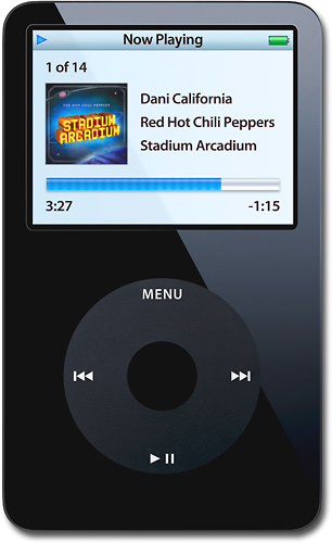 Three things I would take with me to a deserted Island are an I-pod, an entire water tower and a lifetime supply of pizza. With all these essentials I can hold out indefinitely for rescue. usnews
I'm going to need an entire water tank, lets face it, its gonna be hot and I'm already thirsty just thinking about it.
If I could only have one kind of food everyday, it would have to be pizza. While I'm stranded, my plan is to soak up the sights then try to make contact with dolphins. Eventually, when I learn to communicate with the dolphins, I will send them off to flag down a fishing boat.

- enough cereal bars to last me the rest of my trip for food
- the new squab car that can drive under water so I can leave the island when I want to
- my laptop so I could stay in contact with everyone. Since this is my story, I will be able to receive wireless Internet on my island despite the lack of routers in the vicinity.


Subscribe to:
Posts (Atom)